| Author |
Message |
Picou
Bluegill
Username: Picou
Post Number: 256
Registered: 8-2004
Rating: N/A
Votes: 0 (Vote!) | | Posted on Friday, August 27, 2004 - 12:59 am: | 


|
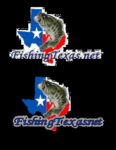
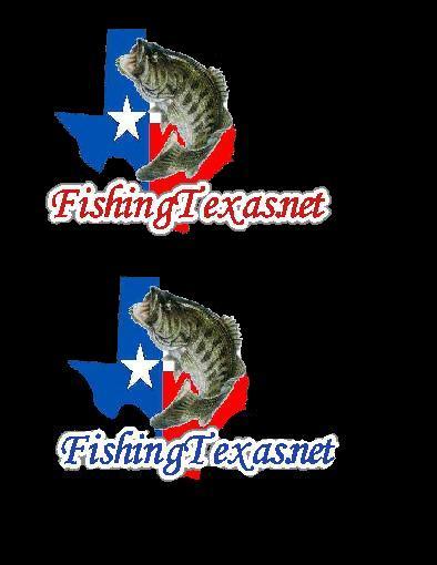
Ok, I did manage to get several of the logos printed up on the clear, but it would not fill in the letters for me so I give...
This is my last shot at it and I am going to have someone make the stickers. I think I favor the block type letters for a window sticker. Probably without the black behind the letters. There will be some extra white but I can live with it.
These are almost actual size:


Your feedback is officially requested again... 
Thank you Lord for my family and the waters I get to fish
|
Barnaclebill
Minnow
Username: Barnaclebill
Post Number: 54
Registered: 8-2004
Rating: N/A
Votes: 0 (Vote!) | | Posted on Friday, August 27, 2004 - 5:43 am: |
|
I like the last one best,, the first one second,, I think the Fonts look better.
just my .02
Born to fish-Forced to work
|
Dale_moser
Moderator
Username: Dale_moser
Post Number: 95
Registered: 8-2004
Rating: N/A
Votes: 0 (Vote!) | | Posted on Friday, August 27, 2004 - 7:30 am: |
|
2nd one.
Fishing is alot like sex: Even when it's bad it's still pretty good!
|
Charles
Moderator
Username: Charles
Post Number: 93
Registered: 7-2004
Rating: N/A
Votes: 0 (Vote!) | | Posted on Friday, August 27, 2004 - 8:15 am: |
|
2nd one with maybe black letters. The white letters might be to difficult to see from a distance.
Dang'it Rudey,Greg and mike look like ooompa loompas from Willy Wonka and the chocolate factory up against Charles !!!!
|
Audra
Moderator
Username: Audra
Post Number: 105
Registered: 8-2004
Rating: N/A
Votes: 0 (Vote!) | | Posted on Friday, August 27, 2004 - 8:18 am: |
|
I like the first one best with black letters. I like the script way better than the block letters. I sent you an e-mail. Can you send me a picture of the state and fish, without the letters, and let me play around a little?
"Men and fish are alike. They both get into trouble when they open their mouths." - Jimmy D Moore
|
Chicken
Minnow
Username: Chicken
Post Number: 87
Registered: 8-2004
Rating: N/A
Votes: 0 (Vote!) | | Posted on Friday, August 27, 2004 - 8:44 am: |
|
2nd one
"I'm tellin ya, there aint no such thang as bein too drunk to fish!"-Dale Moser
|
Picou
Bluegill
Username: Picou
Post Number: 258
Registered: 8-2004
Rating: N/A
Votes: 0 (Vote!) | | Posted on Friday, August 27, 2004 - 9:21 am: |
|
email coming your way Audra. Looking forward to seeing what you come up with.
My concern with the script letters is that they just do not carry out very far from a visability standpoint. Personally, I prefer the script letters for many reasons but I want people to be able to see the name from a few cars away.
Thank you Lord for my family and the waters I get to fish
|
Rudey
Moderator
Username: Rudey
Post Number: 75
Registered: 8-2004
Rating: N/A
Votes: 0 (Vote!) | | Posted on Friday, August 27, 2004 - 10:29 am: |
|
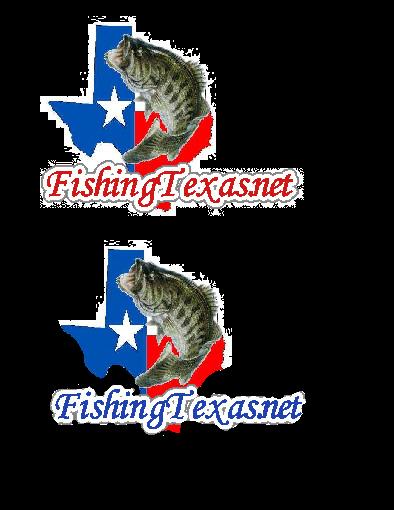
I dunno....I'm thinking #3. You have to remember that a majority if not all of these stickers will be on the back TINTED glass of vehicles. I'm thinking the black background instead of the white will look better.
Just an idea of what the black background of #3 will look like on tinted glass....

Nothing makes a fish bigger than almost being caught.
|
Audra
Moderator
Username: Audra
Post Number: 106
Registered: 8-2004
Rating: N/A
Votes: 0 (Vote!) | | Posted on Friday, August 27, 2004 - 10:34 am: |
|
I sent thes by e-mail, but they don't look very good when sent as attachments, Mike. I tried to make them stand out as much as I can, because of the tinted window thing that Rudey said. If you can't get black letters outlined with white, then the black letters probably won't work. I'm not finished, but I must get out the door. I'll work on them some more later! I like the bottom one the best...so far!


"Men and fish are alike. They both get into trouble when they open their mouths." - Jimmy D Moore
|
Picou
Bluegill
Username: Picou
Post Number: 259
Registered: 8-2004
Rating: N/A
Votes: 0 (Vote!) | | Posted on Friday, August 27, 2004 - 10:45 am: |
|
That is my thought Rudey with adding the black boxes on those two samples. Since most back windows are tinted and they cannot cut out in between the letters, there will be some color behind the letters. The black box will blend in with the darkness of the window.
/image{script}
Thank you Lord for my family and the waters I get to fish
|
Picou
Bluegill
Username: Picou
Post Number: 260
Registered: 8-2004
Rating: N/A
Votes: 0 (Vote!) | | Posted on Friday, August 27, 2004 - 10:46 am: |
|

Thank you Lord for my family and the waters I get to fish
|
Audra
Moderator
Username: Audra
Post Number: 107
Registered: 8-2004
Rating: N/A
Votes: 0 (Vote!) | | Posted on Friday, August 27, 2004 - 10:52 am: |
|
Don't like the red!
"Men and fish are alike. They both get into trouble when they open their mouths." - Jimmy D Moore
|
Audra
Moderator
Username: Audra
Post Number: 108
Registered: 8-2004
Rating: N/A
Votes: 0 (Vote!) | | Posted on Friday, August 27, 2004 - 11:02 am: |
|
What about this? The bottom one!
"Men and fish are alike. They both get into trouble when they open their mouths." - Jimmy D Moore
|
Rudey
Moderator
Username: Rudey
Post Number: 76
Registered: 8-2004
Rating: N/A
Votes: 0 (Vote!) | | Posted on Friday, August 27, 2004 - 11:04 am: |
|
I think the letters are too dark, JMHO.
White lettering shows up much better.
Nothing makes a fish bigger than almost being caught.
|
Big_p
Moderator
Username: Big_p
Post Number: 123
Registered: 7-2004

Rating: N/A
Votes: 0 (Vote!) | | Posted on Friday, August 27, 2004 - 11:09 am: |
|
I like the 2nd one also. |
Picou
Bluegill
Username: Picou
Post Number: 261
Registered: 8-2004
Rating: N/A
Votes: 0 (Vote!) | | Posted on Friday, August 27, 2004 - 1:56 pm: |
|

Thank you Lord for my family and the waters I get to fish
|
Big_p
Moderator
Username: Big_p
Post Number: 124
Registered: 7-2004
Rating: N/A
Votes: 0 (Vote!) | | Posted on Friday, August 27, 2004 - 2:24 pm: |
|
I like the white letter outlined in black. They show up much better that way on the dark tinted windows. The darker letters wouldn't show up intil you got right up on them. |
Audra
Moderator
Username: Audra
Post Number: 109
Registered: 8-2004
Rating: N/A
Votes: 0 (Vote!) | | Posted on Friday, August 27, 2004 - 3:27 pm: |
|
OK, anybody who has time and wants to make these completely black on the background for me...please do so! I like the black better than the red. I like the blue better than the black. What do you guys think?

"Men and fish are alike. They both get into trouble when they open their mouths." - Jimmy D Moore
|
Sluggo
Minnow
Username: Sluggo
Post Number: 17
Registered: 8-2004

Rating: N/A
Votes: 0 (Vote!) | | Posted on Saturday, August 28, 2004 - 5:45 am: |
|
Hey you go Audra. Things are slow this morning!
 |
Audra
Moderator
Username: Audra
Post Number: 110
Registered: 8-2004
Rating: N/A
Votes: 0 (Vote!) | | Posted on Saturday, August 28, 2004 - 8:58 am: |
|
Thanks, Justin. I actually kind of like both of those. Where's Mike? We need an official word from the CEO!
"Men and fish are alike. They both get into trouble when they open their mouths." - Jimmy D Moore
|
Barnaclebill
Minnow
Username: Barnaclebill
Post Number: 65
Registered: 8-2004
Rating: N/A
Votes: 0 (Vote!) | | Posted on Saturday, August 28, 2004 - 9:25 pm: |
|
If you print it , they will come,,,,,,,,,
eagerly waiting!!!!
Born to fish-Forced to work
|
Picou
Bluegill
Username: Picou
Post Number: 262
Registered: 8-2004
Rating: N/A
Votes: 0 (Vote!) | | Posted on Sunday, August 29, 2004 - 10:30 pm: |
|
Atleast 2x the font size and move it up so that the curve in the H fits in the curve in the state. Check out the orientation and size of the ones above that I posted and try to match that scale. The image will have to be actual size to get a decent image for a sticker. I want the stickers to be about 9" x 4 1/2".
If you can get that font larger and stuff, I think we may have a winner. Else, I am about sold on the block letters for stickers just because they will be visable from a distance. Shirts, hats, koozies, etc... will definately be the script text.
Thank you Lord for my family and the waters I get to fish
|
Audra
Moderator
Username: Audra
Post Number: 111
Registered: 8-2004
Rating: N/A
Votes: 0 (Vote!) | | Posted on Monday, August 30, 2004 - 10:19 am: |
|
Let me see what I can do. I should be able to do that with no problem. I made Keith stand back far away to see which one looks better. Even though I like the blue letters better, he said the red shows up better and is easier to read. Which one do you like, Mike?
Let me do some playing and see what I can come up with!
"Men and fish are alike. They both get into trouble when they open their mouths." - Jimmy D Moore
|
Picou
Bluegill
Username: Picou
Post Number: 267
Registered: 8-2004
Rating: N/A
Votes: 0 (Vote!) | | Posted on Monday, August 30, 2004 - 12:58 pm: |
|
I like the red better. Lookin forward to getting them done.
Thank you Lord for my family and the waters I get to fish
|
Audra
Moderator
Username: Audra
Post Number: 112
Registered: 8-2004
Rating: N/A
Votes: 0 (Vote!) | | Posted on Monday, August 30, 2004 - 3:04 pm: |
|
OK, I'm not sure if this will post "real" size or not, but I'll try. (Of course it posted way smaller than it actually is. I've printed it out to check the dimentions). I've got it to about 9.5" by 5.5 inches. That's the best I can do heighth-wise because if I move the lettering up any more, it will cover a lot of the fish. I put a light grey border around the white, just to help it stand out a bit. I have such a hard time getting the black background to show the effect of tinted windows. I really like this one, and I think it will look great on the back of our vehicles. Let me know what you think.

"Men and fish are alike. They both get into trouble when they open their mouths." - Jimmy D Moore
|
Picou
Bluegill
Username: Picou
Post Number: 270
Registered: 8-2004
Rating: N/A
Votes: 0 (Vote!) | | Posted on Monday, August 30, 2004 - 6:31 pm: |
|
Did you get my email Audra, Move the letters up and to the right just a little bit. Covering up the bottom of the fish is fine. The bottom of the G should be at the bottom of the state and the downward curve of the T should be right about at the fish's back.
I'm a picky SOB ain't I... 
Thank you Lord for my family and the waters I get to fish
|
Audra
Moderator
Username: Audra
Post Number: 113
Registered: 8-2004
Rating: N/A
Votes: 0 (Vote!) | | Posted on Monday, August 30, 2004 - 7:38 pm: |
|
It looks that way when you make it big enough for a decal. When you size it down, it moves everything away from the original place I put it. I wish you could see these I've printed out. What are you plans for this weekend? Maybe we can get together and brainstorm.
"Men and fish are alike. They both get into trouble when they open their mouths." - Jimmy D Moore
|
Rudey
Moderator
Username: Rudey
Post Number: 77
Registered: 8-2004
Rating: N/A
Votes: 0 (Vote!) | | Posted on Monday, August 30, 2004 - 7:47 pm: |
|
You need to merge items if it's moving them around when you resize.
Nothing makes a fish bigger than almost being caught.
|
Charles
Moderator
Username: Charles
Post Number: 95
Registered: 7-2004
Rating: N/A
Votes: 0 (Vote!) | | Posted on Monday, August 30, 2004 - 7:50 pm: |
|
Ya'll have talent.
Dang'it Rudey,Greg and mike look like ooompa loompas from Willy Wonka and the chocolate factory up against Charles !!!!
|
Picou
Bluegill
Username: Picou
Post Number: 274
Registered: 8-2004
Rating: N/A
Votes: 0 (Vote!) | | Posted on Monday, August 30, 2004 - 8:02 pm: |
|
Like Rudey said, merge or "group" them so that they are treated as one object. Call me on my cell if you want and maybe we can figure it out. I will be here at work till probably 10:00pm doing homework now since I will be missing class on Wednesday to dove hunt. It is much quieter here for doing homework.
I will be around most of the weekend. I hope to dove hunt at least once this weekend but other than that I have a list of honey do's that is growing steadily...
I wonder if I can get a trial version of the tool you are using to duplicate what you have done. None of the software I have installed will allow me to do that type of border around the font -- at least that I have figured out yet...
Thank you Lord for my family and the waters I get to fish
|
Audra
Moderator
Username: Audra
Post Number: 114
Registered: 8-2004
Rating: N/A
Votes: 0 (Vote!) | | Posted on Monday, August 30, 2004 - 9:04 pm: |
|
Keith said I might can "send" you this program somehow. I don't know how I'd do that though. I'm not sure what that means to "group" or "merge". If I open the saved file in paint then resize, then it makes everything grainy and distorted. When I complete the project in print artist, it looks great, and it prints great, but when I post on here, it looks different. It stays the same if I re-open the file to make adjustments or print. It only changes when I try to show them to you guys...that figures!  The ones I have printed out look great! I just need to figure out a way for you to see them. The ones I have printed out look great! I just need to figure out a way for you to see them.
"Men and fish are alike. They both get into trouble when they open their mouths." - Jimmy D Moore
|
Picou
Bluegill
Username: Picou
Post Number: 276
Registered: 8-2004
Rating: N/A
Votes: 0 (Vote!) | | Posted on Monday, August 30, 2004 - 9:37 pm: |
|
Try and print to a file and see what you get on the file.
Once you have it all sized and looking the way you like, look at the various save options. Or, go to the edit menu and look for "select all" and then go over the selected area and right click your mouse to see if it has a "group" or "merge" option.
Another option is to have the image on the screen the way you like it then type "Ctrl and PrintScrn" at the same time Print Scrn should be next to the F12 key on the keyboard. Then, go to paint and open a new image. Make sure that you are on the "crop" selction (top right option where you select text, erase, boxes, fonts, etc...) do a paste and you should have the entire screen captured. Select the area you want to keep and copy it to another image.
Oh the joys...
Thank you Lord for my family and the waters I get to fish
|
Audra
Moderator
Username: Audra
Post Number: 115
Registered: 8-2004
Rating: N/A
Votes: 0 (Vote!) | | Posted on Monday, August 30, 2004 - 9:43 pm: |
|
I'll see what I can do tomorrow. I'm headed to bed!
"Men and fish are alike. They both get into trouble when they open their mouths." - Jimmy D Moore
|
Audra
Moderator
Username: Audra
Post Number: 116
Registered: 8-2004
Rating: N/A
Votes: 0 (Vote!) | | Posted on Tuesday, August 31, 2004 - 8:50 am: |
|
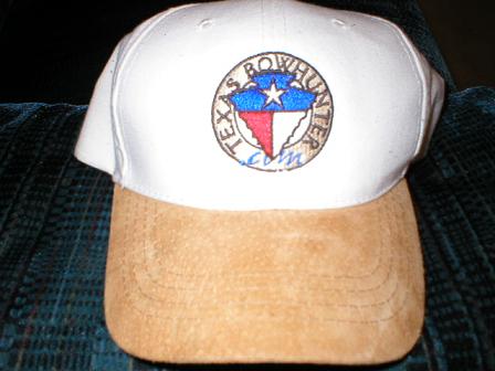
Mike, here is a pic of the TBH cap I like so well. The cap is cream, and the bill is brown "suede". This style cap would look great to offset the white in your logo.
"Men and fish are alike. They both get into trouble when they open their mouths." - Jimmy D Moore
|